Teleport is not just a taxi, but a new perspective on getting around the city. Fast, tech-driven, comfortable — like an instant leap through space.
Client
Teleport Taxi
Year
2021
Deliverable
Branding Identity


Info
Teleport — A Taxi That Changes the Rules of Movement
Task:
To create an identity that conveys speed, precision, and a modern approach to urban travel. The brand should look technological, yet not cold — with a sense of comfort and lightness.
Solution:
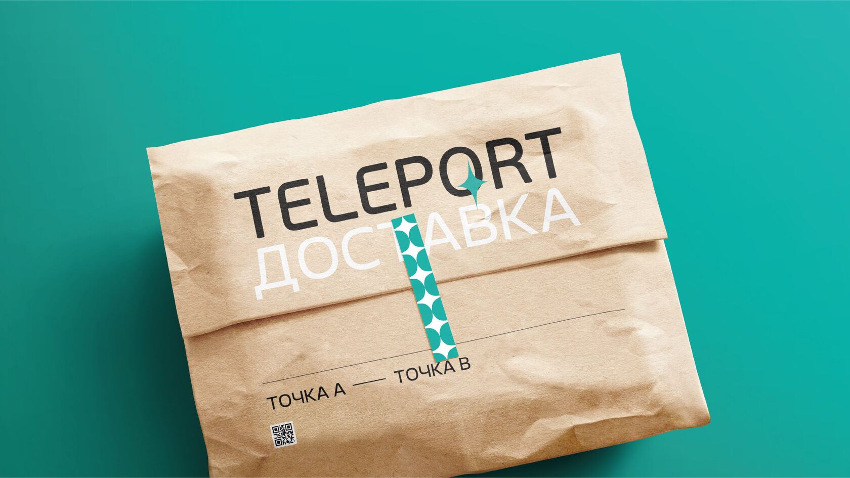
Symbol — a star-shaped rhombus, representing a quantum leap, dynamics, and the freedom to move in all directions.
Sea-breeze color — fresh, modern, highlighting the lightness and innovative nature of the service.
Graphics and typography — clean, minimalist style with an emphasis on movement and smooth lines.
Result:
A visual system was developed that makes Teleport stand out among urban services. The identity easily scales from a mobile app to transportation navigation and pickup points. Now moving around the city is not just a ride — it’s a real teleport!


